Tallgrass Pasta Packaging
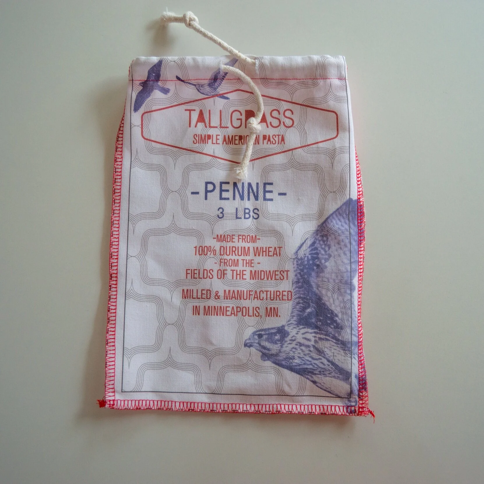
For the final project in a graphic design course, I had to create a complete set of packaging for a fictional company. I invented Tallgrass, an American pasta manufacturer based in Minneapolis that sourced its raw materials from regional farms. I come from a half-Italian household, and the project was inspired by how most pasta brands, even those not made in Italy, still draw on Italian words and imagery. Tallgrass would embrace an American identity, specifically one tied to the Midwest and its history of milling industry.
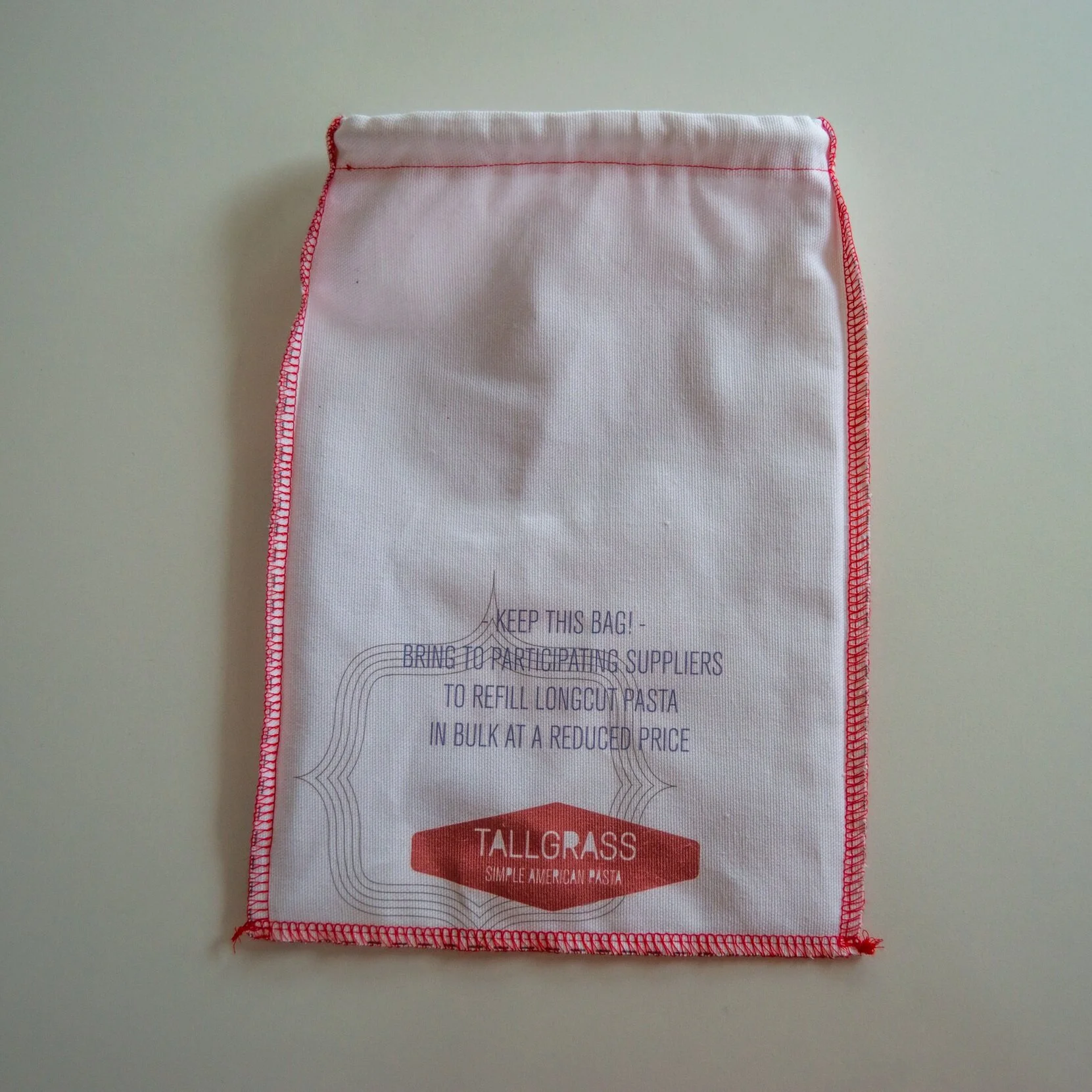
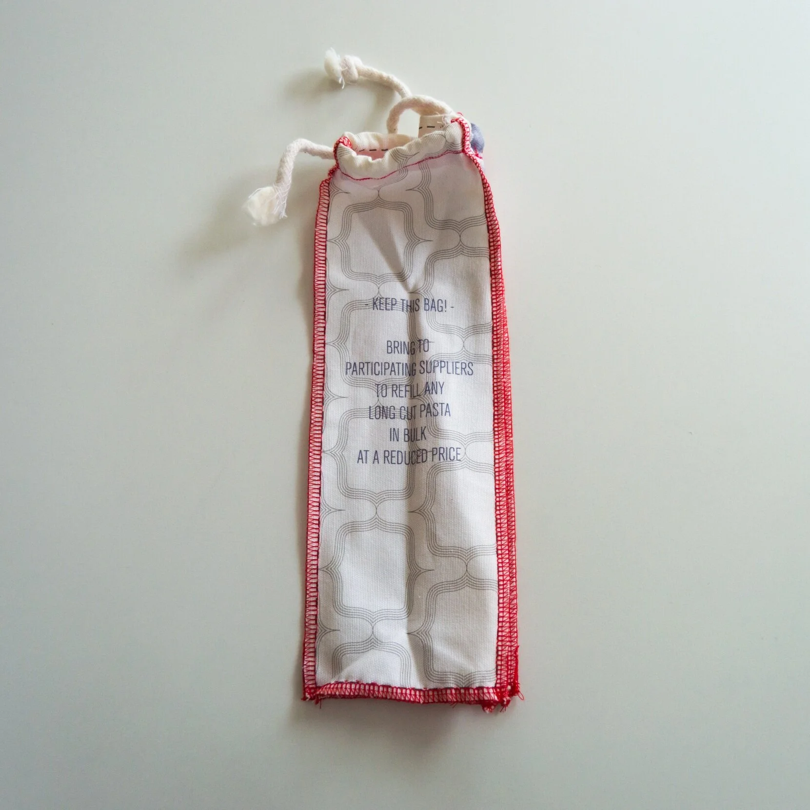
I love the simple and rustic look of early 1900s flour sacks that came out of the milling industry in the Twin Cities, so the packaging for Tallgrass draws upon that aesthetic. The pasta would be packaged in simply constructed fabric bags that are designed to be reusable. In the region Tallgrass operates, they would have bulk pasta dispensers at grocery stores that could refill the bags of repeat customers. The imagery on the bags draws on wildlife found in the prairies of the Midwest, the same locations where the grain would be sourced from. The simple red, white, and blue color scheme is vibrant and relates to classic Americana. The overlapping graphic elements recall the roughly constructed flour sacks and the imprecise printing methods from the turn-of-the-century.


